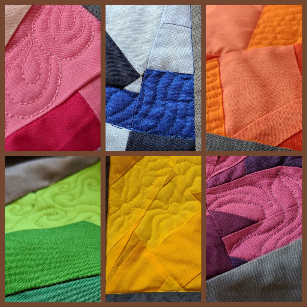
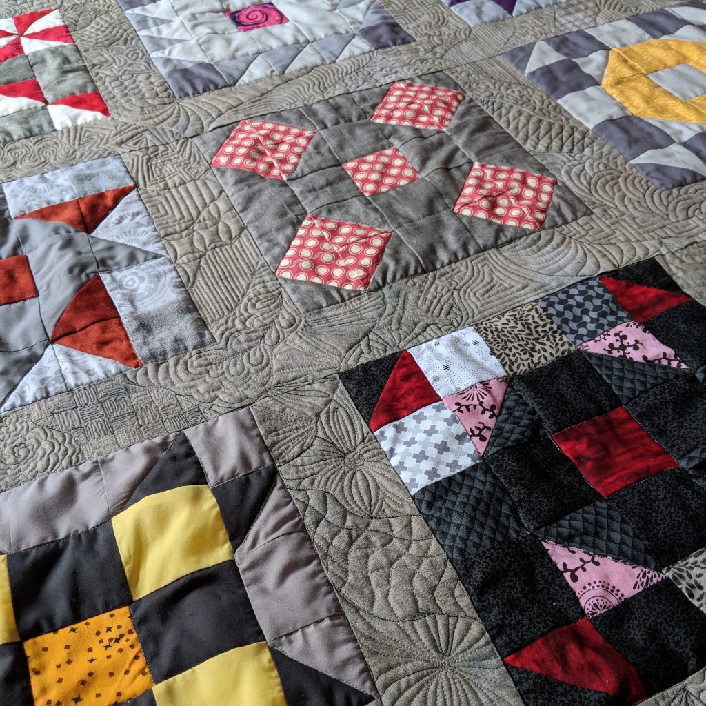
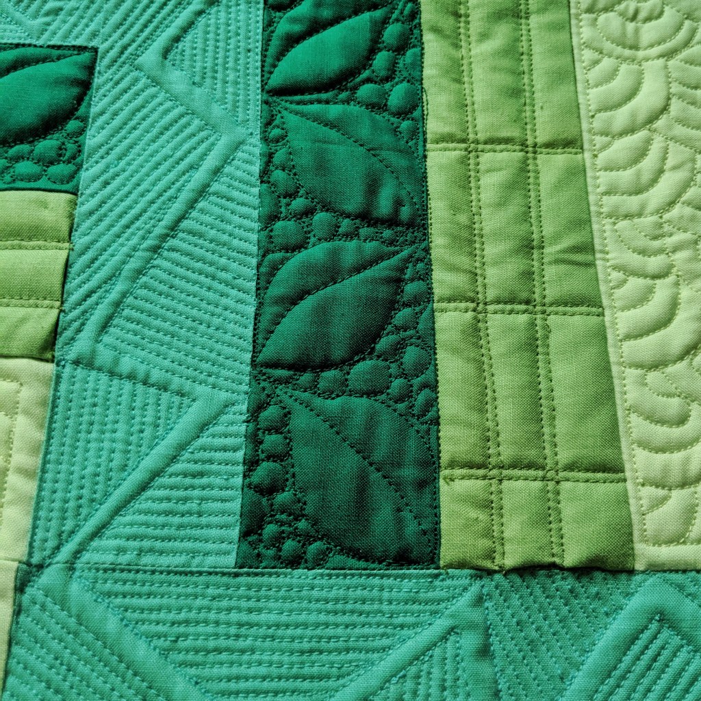
All right, folks! If you’ve been following my “Creating a Quilt” series, you’ve seen my process from thinking of an idea all the way up through the quilting design. There are only a few details left, but I assure you they’re just as important as all of the rest!
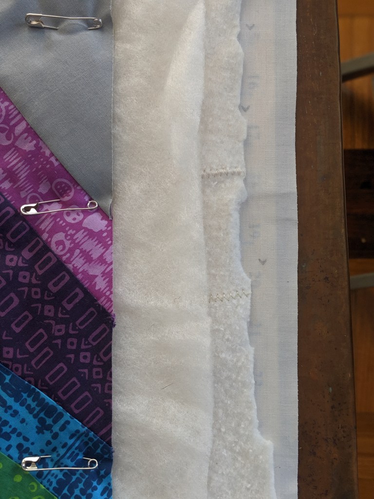
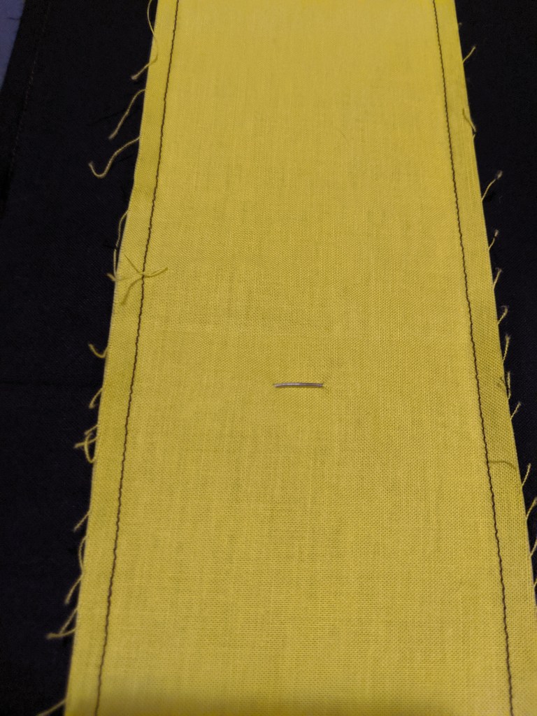
First, I need to trim off all of the extra batting and backing and square up the whole quilt. When I square up a quilt, I try to find some element of the quilt that I can use to measure with that will get me an even trim around the whole quilt. In this case, I used the outer black border. I then place the largest square ruler I have in one of the corners of the quilt, line it up so I’m cutting off an even amount on both sides, and trim up the right-hand side of the ruler and then over the top. Then I use my long 24″ ruler to continue the cut all the way to the next corner.
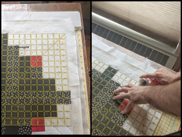
I tend to switch between my long ruler and my square ruler, but you could just as easily use your long ruler all the way around once you’ve decided on the amount you want to trim. Ideally, I trim as little of the actual quilt top as possible while still making sure that no batting will be seen once I attach the binding.
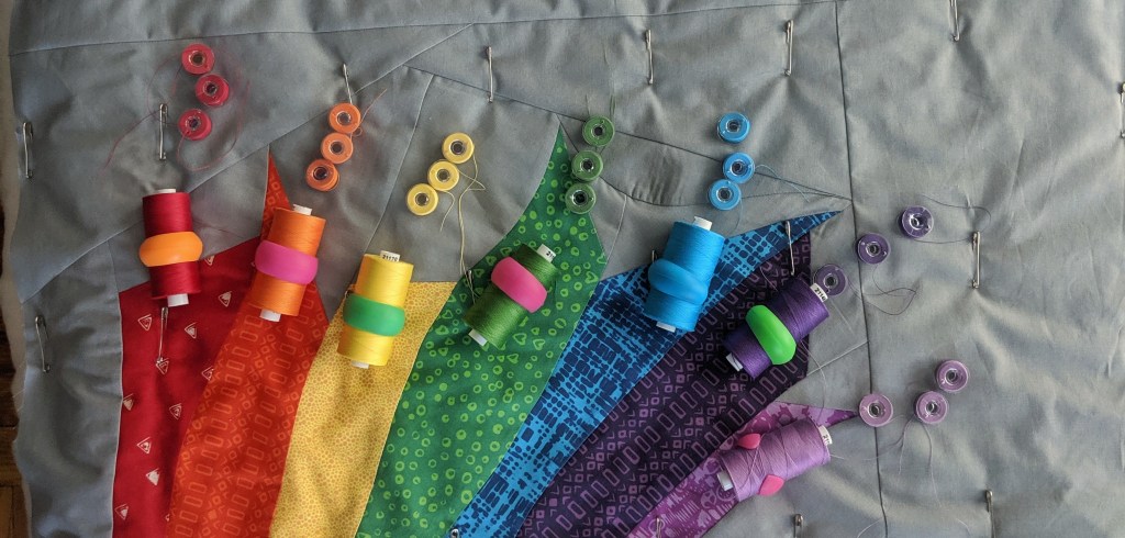
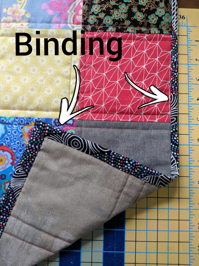
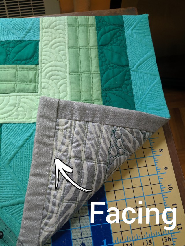
Speaking of binding, that’s the last important design decision that must be made. Actually, before even deciding what kind of binding you want, you need to decide if you want to actually bind your quilt or use a facing instead. Binding a quilt is definitely the most common way to cover up the raw edges of a finished quilt, especially quilts that you want to snuggle under. A binding creates a lovely frame around your quilt top while making sure all of your raw edges are securely enclosed. Depending on what kind of fabric or print you choose for your binding, it can either blend in or really pop out.
I’ve also used facing for several of my quilts, though usually for quilts that are meant to hang on walls. When you face a quilt, you basically pull the raw edges over to the back and cover them with a different kind of binding that won’t be seen on the front. This gives the quilt a frameless look. I really love facing my quilts when I want the viewer to imagine my quilting designs continuing off of the quilt.
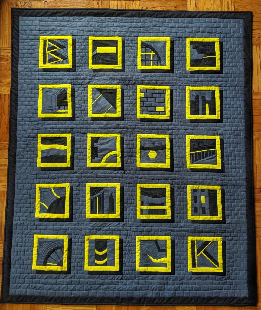
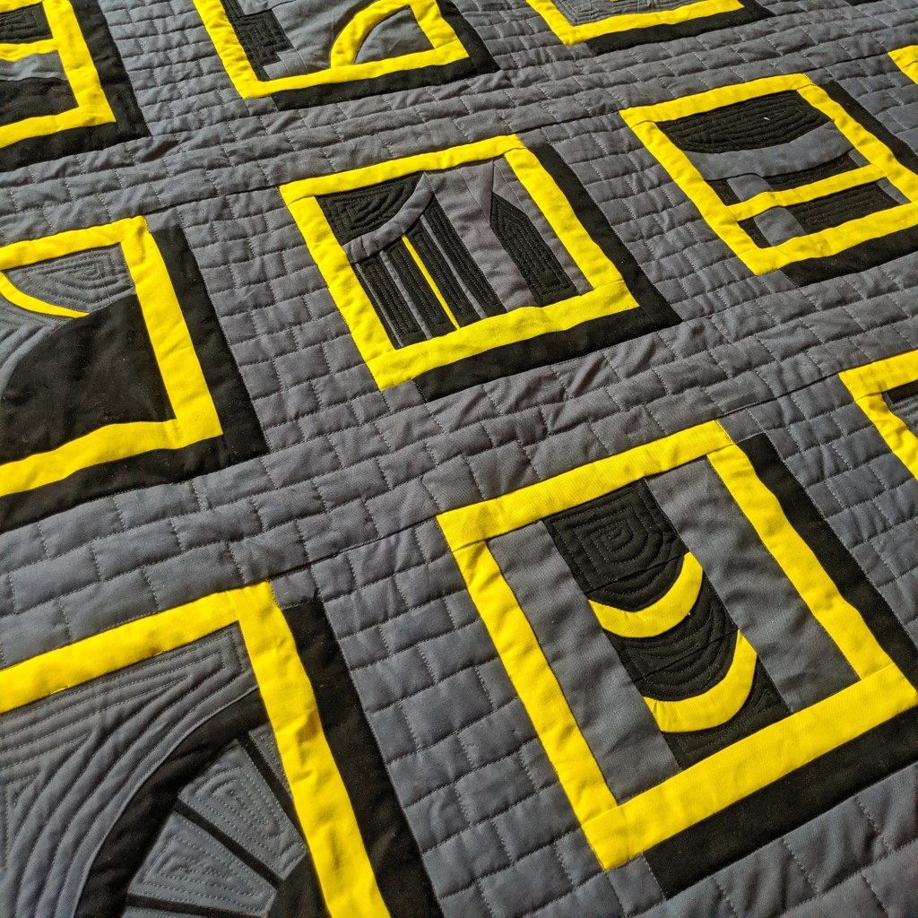
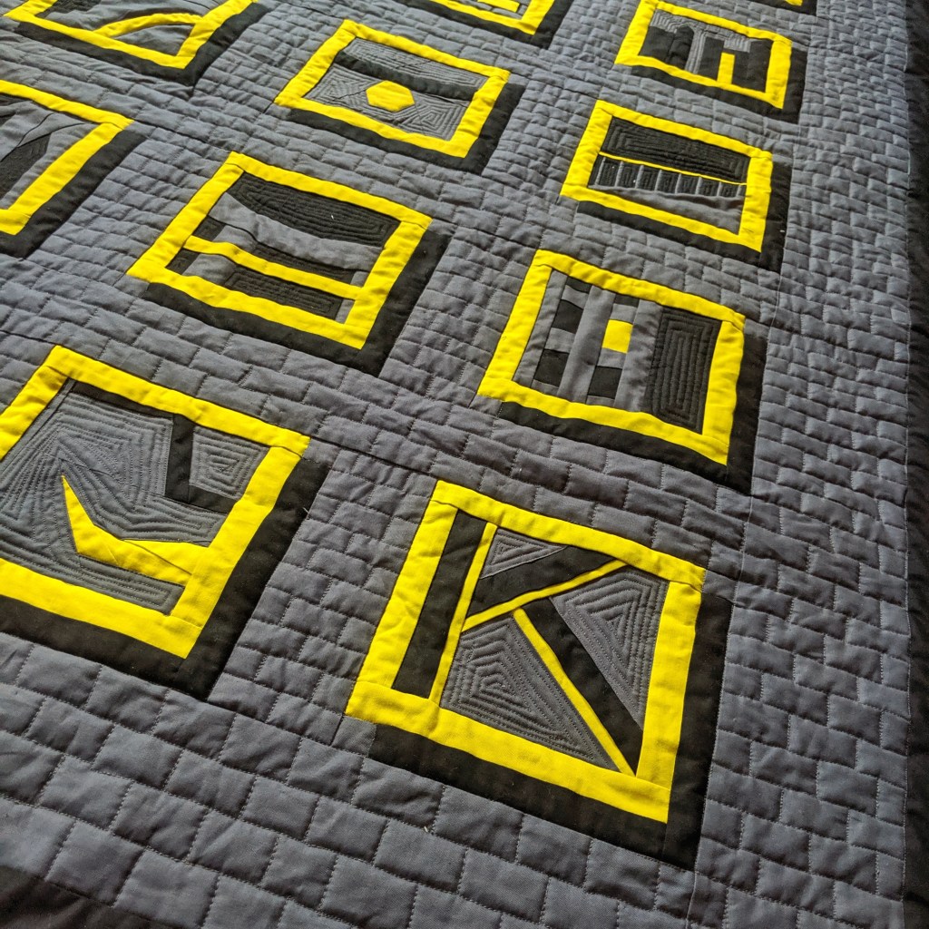
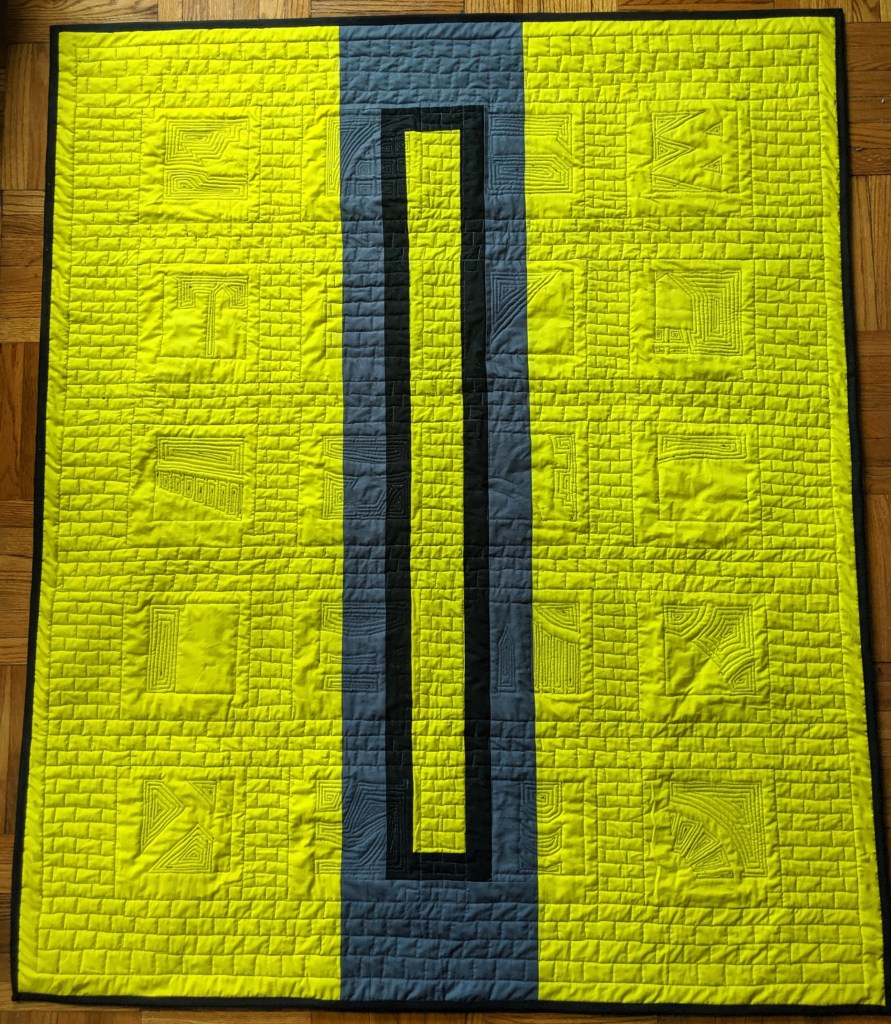
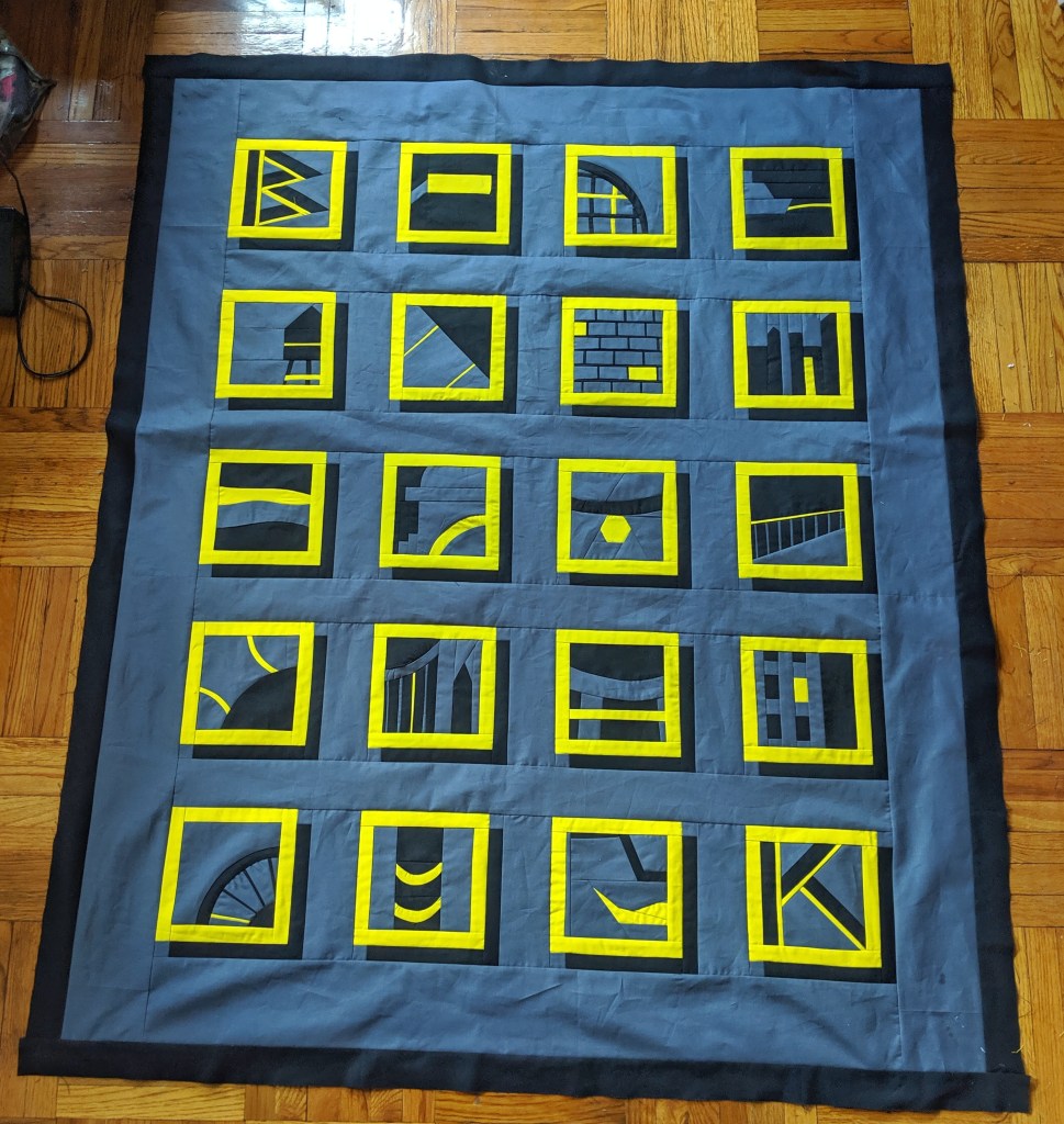
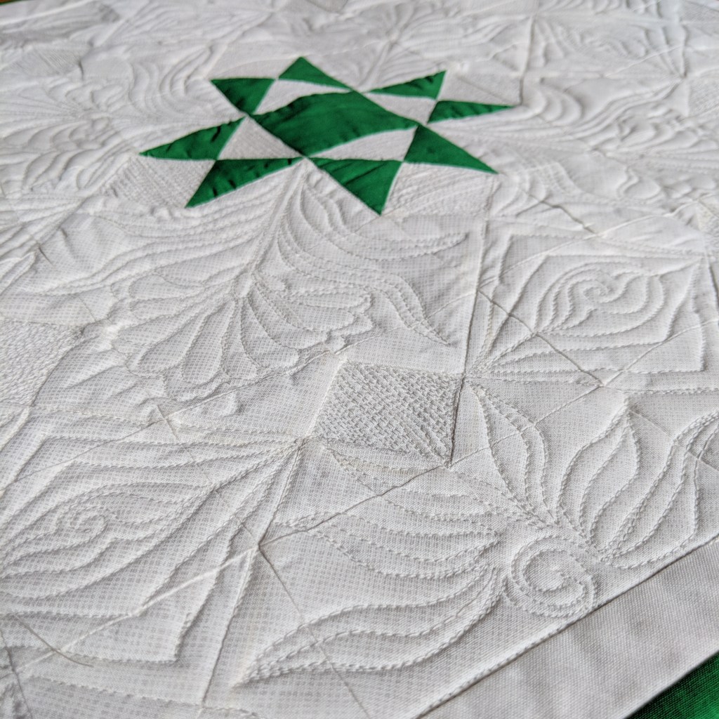
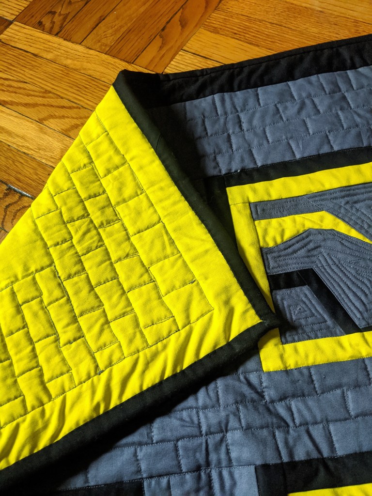
In the case of this quilt, I had already decided to add the black outer border as a solid frame, so I decided a simple black binding that blended in would be the perfect way to finish it. I generally machine sew the binding onto the front of the quilt and then hand stitch it to the back. I really love how it looks on both sides when I use that technique.
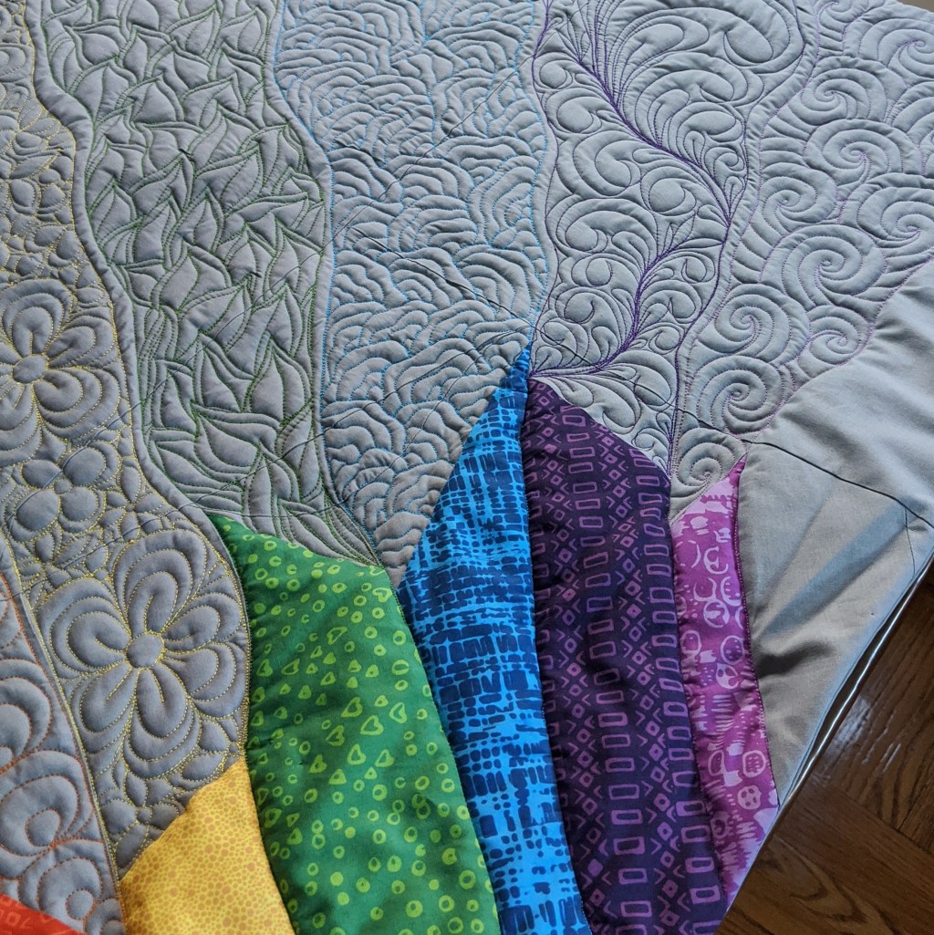
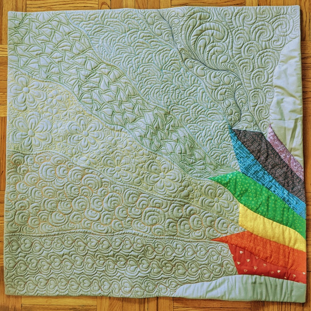
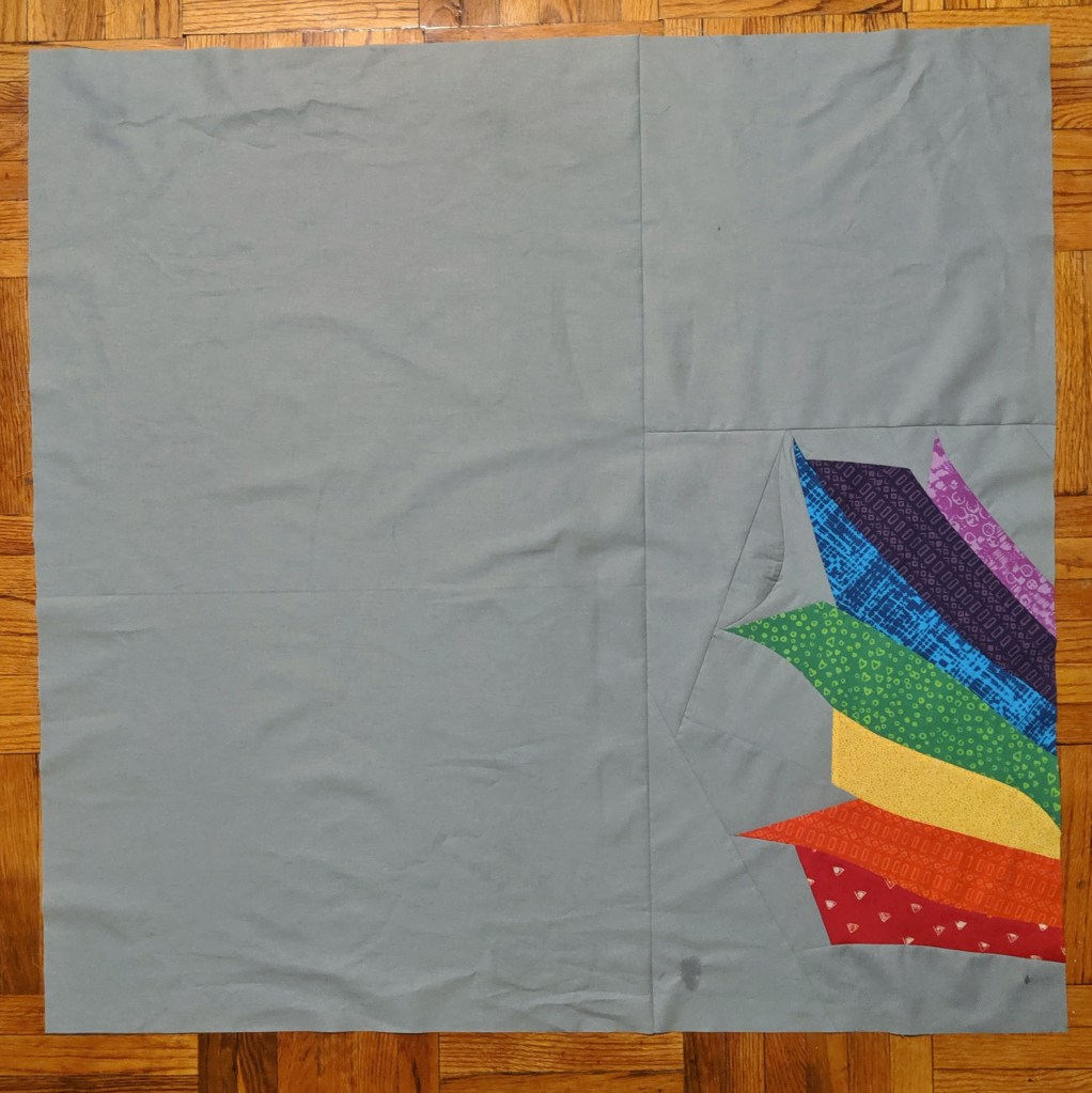
Once the last stitch of the binding has been sewn, I usually consider my quilt D-O-N-E. However, when a quilt is going to be displayed, it needs a couple more elements added to it — a hanging sleeve and a label. There are different ways to display your quilt, so if you’re entering your quilt in a show be sure to read the guidelines for how that particular show wants you to attach a hanging sleeve. I went ahead and used some more scraps from my quilt to construct this hanging sleeve. I like how it kind of blends into the back, though I don’t always care so much about that since it won’t normally be seen by anyone.

As for the labels, I like to make mine by hand. I include the name of the quilt, my name, my social media handle, my location, and the date the quilt was completed (I just use the month and year). Because I’m not selling my quilts at this point, I’m not too worried about how professional my labels look. I’m kind of digging the homemade vibe they have right now.

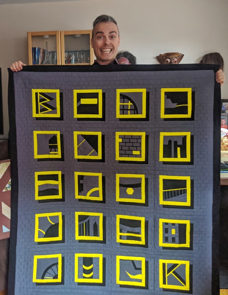
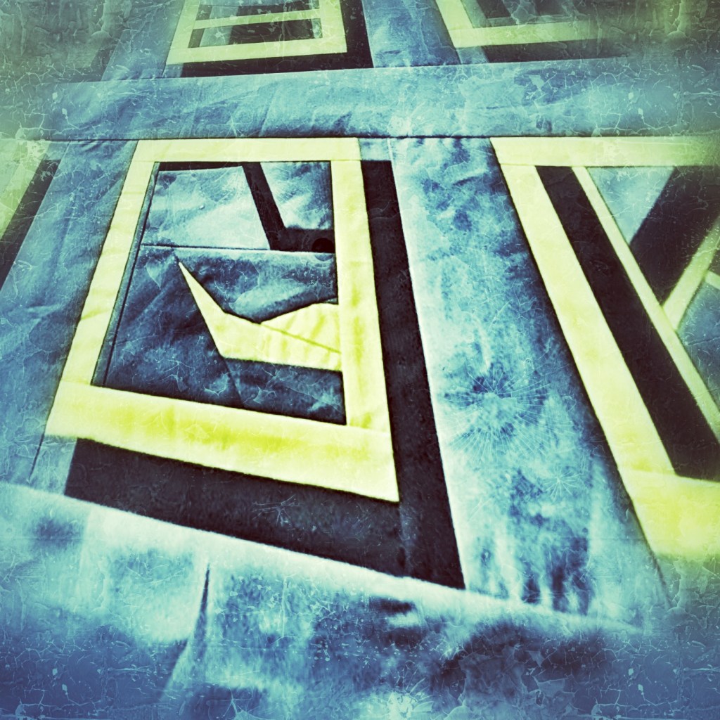
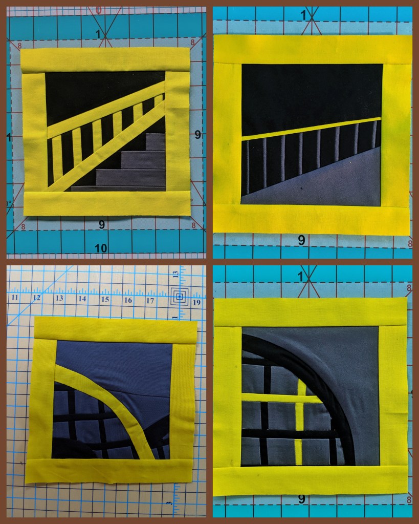
One thing you may remember from one of my earlier “Creating a Quilt” posts is that I was planning on calling this quilt “Dear Brooklyn,” as an homage to the Dear Jane quilt pattern. However, as I started actually making the quilt, I realized my quilt really looked nothing like a Dear Jane quilt and instead my blocks looked more like Polaroid snapshots. So one of the last design decisions I made was to change the name to “BK Snaps.”

And now my quilt is officially finished. Huzzah! I really loved the entire process of creating this quilt, and I’m so glad you came along on the journey with me. I’d love to hear about your own quilt-creating process or any sort of creative process you use whenever you’re crafting anything. Please leave comments or questions in the Comment section below, so we can all learn from each other and continue to thrive as a creating community! Happy crafting!!