Quilting 101: Color Theory

I imagine most of you crafty, quilty people out there have a natural sense of color — what you like and don’t like, what colors work together, etc. — so you may dismiss any sort of deep dive into color theory, preferring to stick with your intuitive sense of color rather than thinking too much about it. I totally get that! And I don’t necessarily disagree. Trusting your own color sense is very important as an artist. But I also believe that knowledge is power, and having even a little bit of knowledge can elevate your color game.

Before I go any further, I have a big ol’ disclaimer. I am by no means a color theory expert. I have sat in on a couple different color theory classes, though never as an actual student. This post is just brushing the surface, so if you are fascinated by the topic or you want to really up your color game I strongly urge you to check out some of the resources I’ll list at the end of the post.

Something to keep in mind is that color is science. Every color is a specific frequency of light that we can see because of the rods and cones in our eyes. And while most of us do not need to spend years studying the science of light and color theory in order to create visually stunning pieces of art, having a basic understanding of how colors actual work together can help you in those moments when something is just not coming together and you can’t intuitively figure it out.

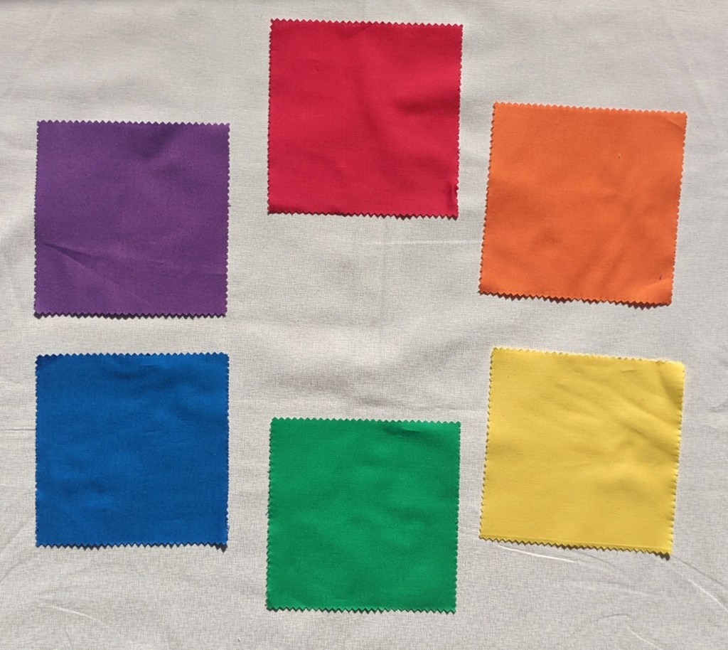
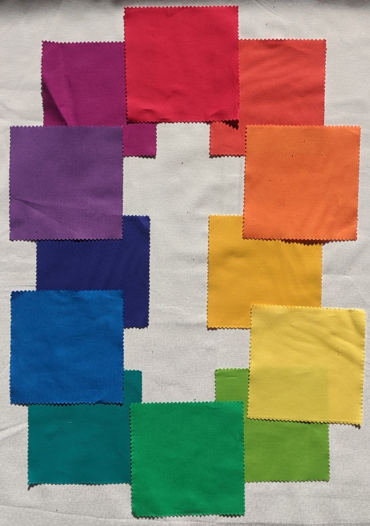
Most of us learned about the primary, secondary, and tertiary colors in grade school. You start with pure red, yellow, and blue. Those are your primaries.

When you mix red and yellow, you get orange. Yellow and blue give you green. Blue and red = violet. Those are your secondaries.

Then your tertiary colors are red-orange, yellow-orange, yellow-green, blue-green, blue-violet, and red-violet. All of these colors can be beautifully organized in a color wheel to show their relationship to each other.

As a heads up, many color theory classes these days work with a different set of primaries, secondaries, and tertiaries based on printer colors. I am not going to go into any detail, but I just wanted to mention it in case you encounter it elsewhere. So if someone tells you that the primary colors are magenta, cyan, and yellow, they are not selling you a line of BS. They’re just working with a different color wheel.

When I’m thinking about color and a quilt design, I generally think about figure, background, and contrast. What do I want to stand out in my quilt? What do I want to blend in? Do I want any transparency effects? These questions are often better answered when you have a grasp on color theory versus just relying on your intuition.

In order to understand how color can help define a figure from a background, let’s start with some basic color vocabulary. To get a grasp on these definitions, I’m going to use one color. Let’s go with green. Hue is the name of a color. Green is a hue.

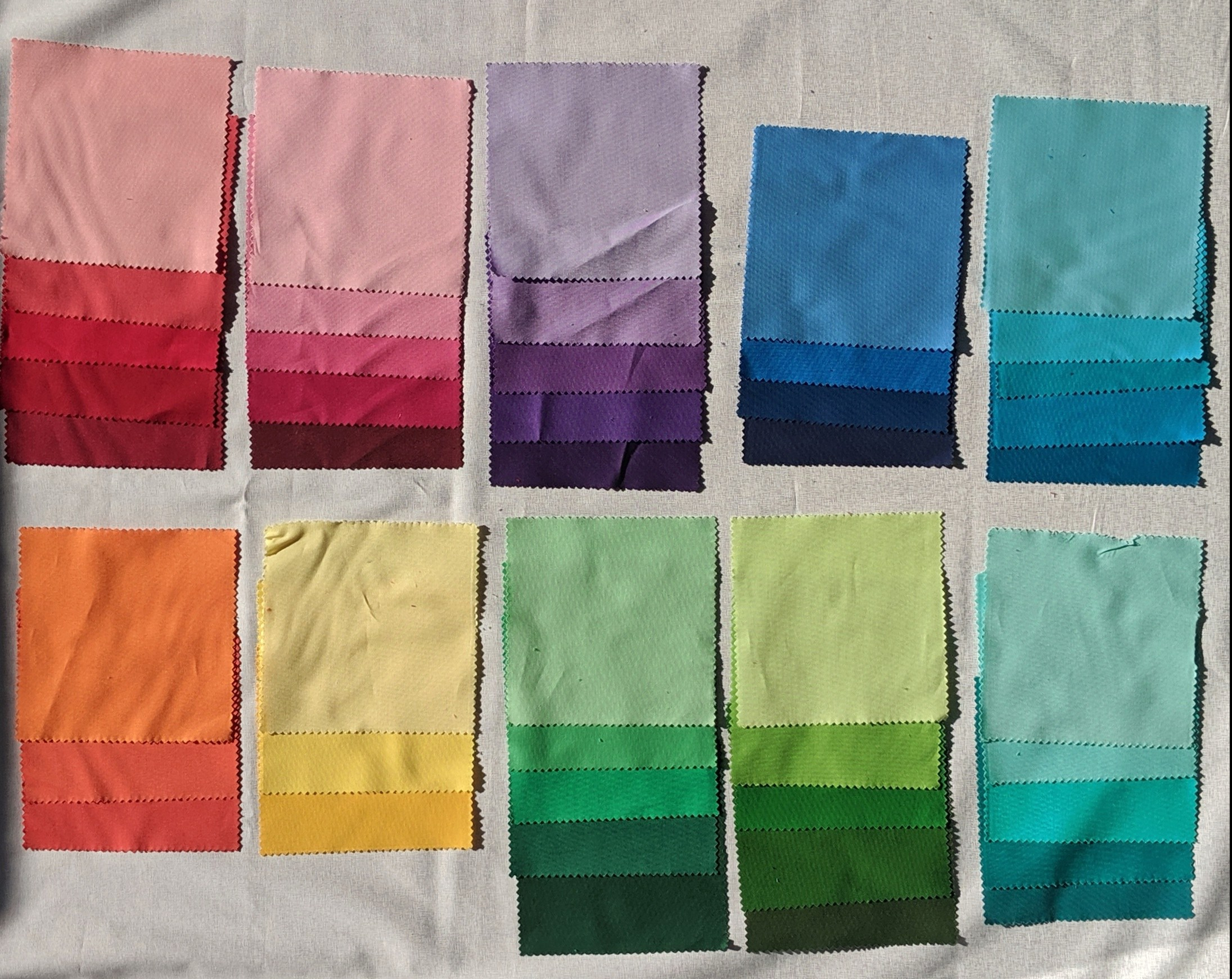
Saturation is the intensity, or purity, of a hue. Adding gray to a hue will lessen the saturation, making it look duller.

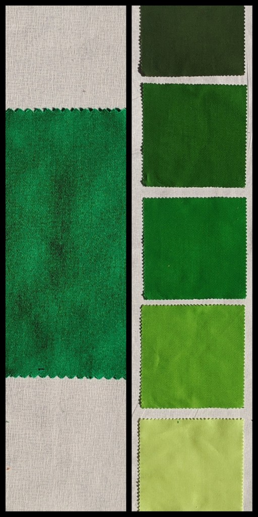
Value is how light or dark a hue is. Adding white to a hue gives it a lighter tint. Adding black to a hue gives it a darker shade.

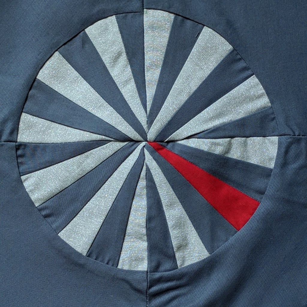
Looking at a color wheel can quickly help you see the relationships colors have to each other. The colors that are opposite each other on the wheel are complementary. Red and green, blue and orange, violet and yellow. Complementary colors provide striking visual contrast. And depending on the saturation you use, it can even make your eyes do some funky things and create visual effects.

Analogous colors are next to each other on the color wheel. They blend together very easily which is often soothing to the eye.

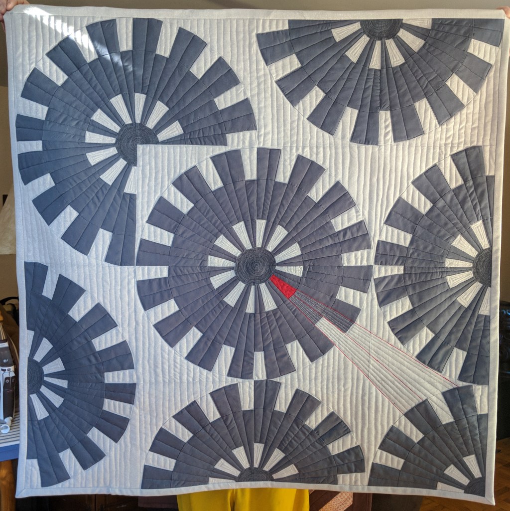
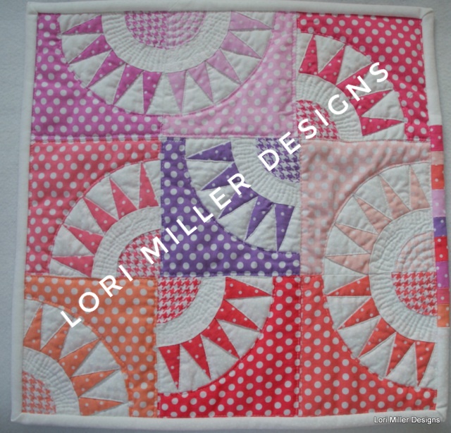
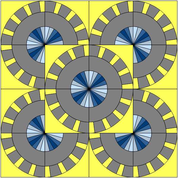
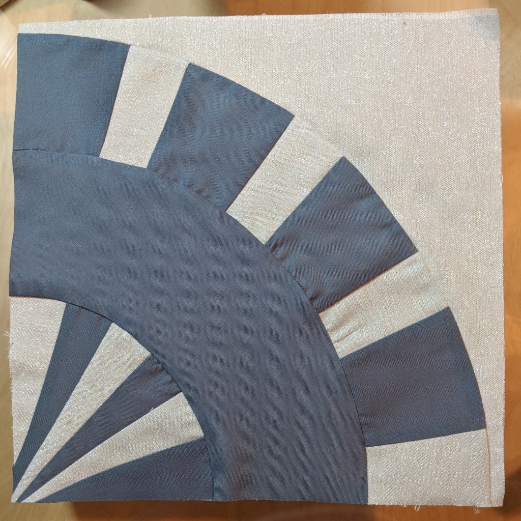
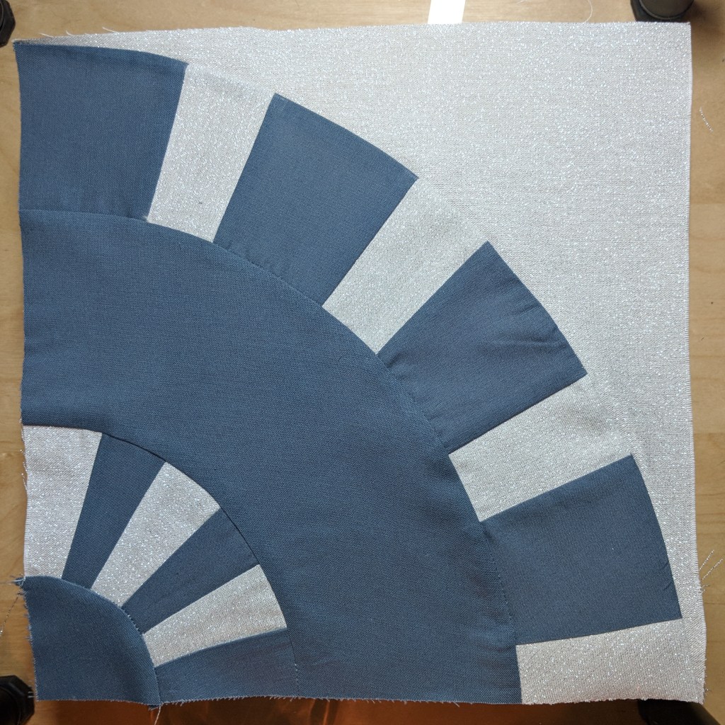
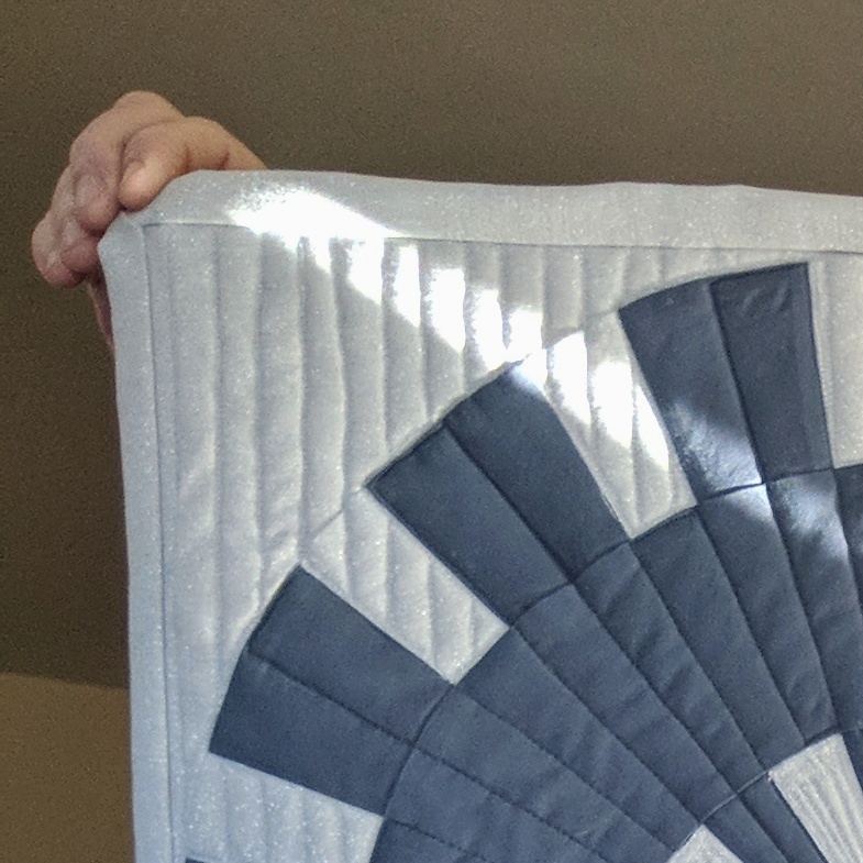
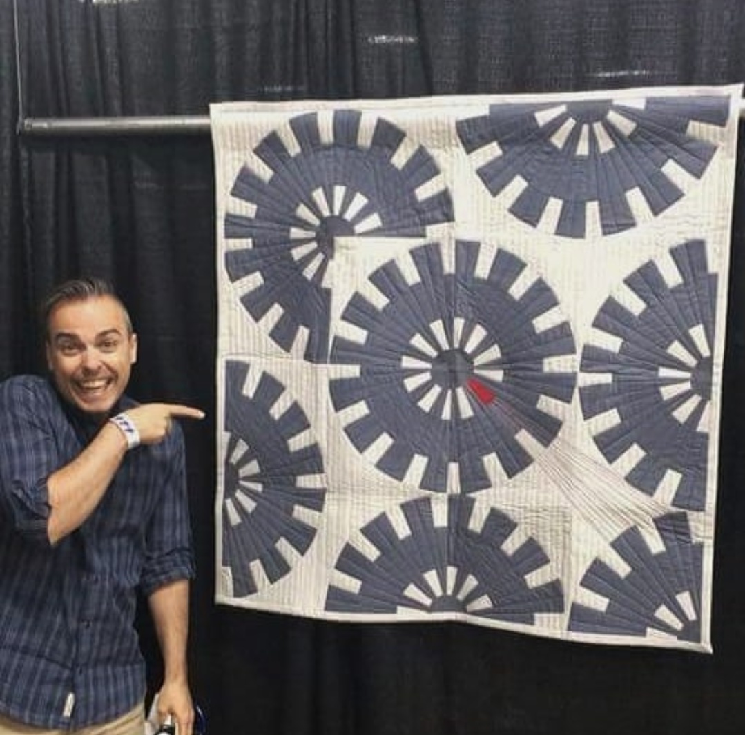
When I’m thinking about a quilt design, I think about what I want to stand out, which I call the figure. The “figure” could be an actual object, but it could also be just the main design motif that I want to emphasize in the overall quilt. Most everything else is the background.

Here’s something you have possibly never really thought about. If you want to create depth in your design and you’re using a dark background color, warm colors — red, orange, yellow — will appear closer, and cool colors — violet, blue, green — will appear farther. However, if you’re working with lighter backgrounds, the opposite is true. Isn’t that fascinating? This is one of those examples where knowing the science can be helpful because you wouldn’t necessarily know this intuitively.

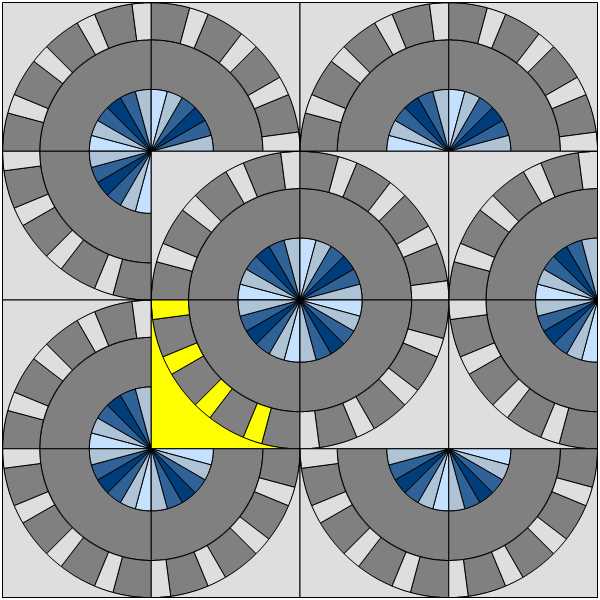
Sometimes I see people struggle with losing their overall quilt design because they smashed together all of their favorite colors rather than selecting colors that provide enough contrast to create figure and background. When you’re looking at your quilt design, decide what part of the design you want to stand out. Use your favorite colors for that part. Then use a neutral for the rest, and that will be the background of the design. Your “neutral” can even be a color, but make sure it is very different in saturation and/or a significantly different tint or shade from the main colors of your design.

If you’re still struggling with your figure disappearing into your background, take a photo of your quilt design with your chosen colors with your phone. Then use one of your photo editing apps to turn into a black-and-white picture. Now you can really see the saturation level of each color by seeing them in the grayscale.

If all of your colors are close to or have the same level of gray in your picture, you might want to pick some different tints or shades of certain colors so that the main part of your design will stand out.

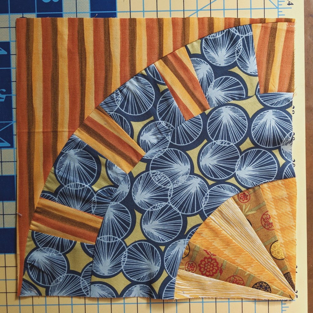
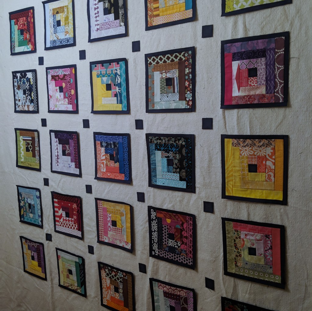
And stepping away from color just a bit, what I just said above can apply to print patterns as well. I love me some scrappy quilts, but make sure you’re creating contrast with high-volume prints and low-volume prints so that your overall design doesn’t disappear due to lack of contrast among all of the different prints you’ve chosen.

I think I’m going to stop now because, honestly, my knowledge only goes so far. However, I want to give you some great resources if you decide you want to really dive into the details of color theory. My first suggestion is find a local color theory class offered by a college or university or local artisan. Not only will you get firsthand knowledge from experts in their field, but you’ll also work on projects that will really cement the lessons. If that’s not possible for you, there are plenty of tutorials online. One of those tutorials is “Color Theory for Quilters” with Katie Pasquini Masopust for iQuilt.com. It is not free, but it is specifically geared for quilters so it’s worth a look. I also really like the website worqx.com. It goes through many aspects of color theory in a relatively simple manner. There are also some fun games you can download to your phone like I Love Hue and Blendoku. Either game is a fun way to get a better feel about how colors work together.

I would LOVE to hear from YOU about your own color theory journeys and ideas. We all see and think about color differently, and no one is ever wrong as long as they love what they’ve created. Please share your stories in the comment section below. Happy Quilting!!

Designing My First Original Quilt: A Step-by-step Guide

The quilt featured on my home page is the very first original quilt I ever designed, pieced, and quilted all on my own. In making this quilt I had the epiphany that I feel so much more joy when I create a quilt from scratch rather than following someone else’s instructions. This is not a judgment for anyone else’s process or creative expression. We are all on our own journeys, and I respect and honor that. But for me, I find more fulfillment realizing my own creative ideas versus someone else’s. In this post, I want to take you through the process of creating this quilt from start to finish. If you haven’t tried designing your own quilt, I hope this inspires you to rise to the challenge. You might be surprised how it could change your outlook on your creative process!

This particular quilt started with a prompt. The Brooklyn Quilters Guild was gearing up for its 2018 quilt show, and the co-presidents put out a mini quilt challenge to celebrate the guild’s 25th anniversary. We were given the following parameters.

R E Q U I R E M E N T S :

Shades of gray (white OK)

A drop of red, not more the 3 x 3 inches or less than 1 x 1 inch.

40 x 40-inch quilt

Quilt pattern of your choice

Quilt must have sleeve, label, and name attached.

Keep in mind that we are celebrating the 25th anniversary of our guild, our new location at Industry City, and a little modern twist. Be creative, have fun, and make some beautiful fiber art.

I didn’t really know this about myself at this point since this was my first original quilt, but I have since realized that I love prompts and parameters. Creating something out of thin air does not come easy for me, so I need a starting off point, even something rather open like the above prompt. I began thinking about being a Brooklyn quilter and a New Yorker. I had been seeing a lot of New York Beauty quilts online recently (see photo below), and I thought it might be fun to do an industrial twist on that idea.

I opened up Electric Quilt 8 (EQ8) on my computer and drafted a block that resembled a quarter of a cogwheel.

One of the many benefits of working in EQ8 is that I was then able to print out paper templates for the block.

I grabbed some fabric scraps and created a very rough draft of the block just to make sure everything fit together and the dimensions were correct.

Then I went back into EQ8 to begin playing with the overall quilt layout. The images below are just a couple of layouts I tried out. Using the computer program allowed me to make quick adjustments without having to actually sew all of the blocks together like you would with a design wall.

Now it was time to figure out the real fabric I wanted to use. I found a great fabric shop on Etsy called AA Cotton Creations, and they had just what I was looking for. I chose a light gray background fabric with just a touch of metallic glitter to honor the silver anniversary of the guild. Then I decided to go with Kona Cotton in Metal because, you know, the cogwheels are made out of metal. Nothing too mind blowing there! Once the fabrics arrived, I began cutting them up and piecing them together into my 16 blocks.

After piecing all 16 blocks, I realized I might not like how the center spokes come together once the blocks are sewn to each other. I decided to piece four of the blocks together to make one complete cogwheel to see how it would look.

AAAHHH!!! That is NOT what I wanted the center of my cogwheels to look like! I went online to look at actual cogwheels and realized I was missing the essential central hub. So I picked these blocks apart and added another quarter circle to each block.

Wow! What a difference that made! I talked about process in my previous post, and this is yet another example of how the creative process is usually not a barrier-free journey from beginning to end. Don’t let these challenges discourage you. Get that problem-solving brain working and overcome these obstacles because the end result will be so much more worthwhile!

Now that the top was pieced together, it was time to quilt. I really liked how modern this quilt looked, so I wanted the quilting to reflect that same feeling. I decided to quilt straight lines going from top to bottom in the background. But because I wanted a feeling of movement to come from the cogwheels, I quilted straight lines moving in the direction of each of the teeth of the cogs. I filled the hubs with thread to give them a fun texture.

I had my friend Ryan come over as a second pair of eyes to look at what I had done so far, and he wanted to see some red thread used in the quilt. That’s when I thought of having the red piece start to emit its own light in opposition to the rest of the lines. Then I quilted gem-like lines in between the center spokes so that I could have the red “gem” start to crack and break. I thought a silver metallic thread would be a fun way to add just a bit more glitz to the quilt to emphasize how this red piece was breaking out from the machine.

And that’s pretty much it! I love how this quilt came together. There were many frustrating moments, but I couldn’t have been happier once it all finally coalesced into my first original quilt. I’d love to hear your thoughts on what you think about creating an original quilt versus following someone else’s pattern. What brings you more joy? Tell me what you think. Happy Quilting!!!

Pennsylvania National Quilt Extravaganza, September 2018

The Craft of Quilting: Process

Many moons ago, I earned a degree in Musical Theater. Tra-la-la!! As I was learning how to sing to the balcony without ripping out my vocal cords and how to form the perfect pair of Fosse jazz hands, I also learned about the difference between art and craft. The art of acting — or painting or playing the violin or dance, etc. — is not easily defined and can be associated with vaguely defined terms like “talent” or “the it factor.” The ability to tap into that mysterious inner fire of creation is essential to any artist. But equally essential is the development of one’s craft in conjunction with their art. Yes, to be a successful actor, you need to have that inherent ability to capture the attention of a 1,500-seat theater full of people and bring them with you on your character’s journey. But being able to successfully do that eight performances a week, 50 weeks a year requires craft.

Now, I have to admit that when I first started quilting, I didn’t think too much about any of this. I mean, sure, I was learning techniques and trying to improve each time I pieced a block together, which is part of honing one’s craft. But as long as I was following someone else’s instructions to achieve their design, the idea of process never really crossed my mind. In fact, it wasn’t until my third original quilt that I realized I couldn’t wing my way through designs that were percolating in my head and just expect them to appear fully formed under my sewing machine.

You see, I had decided to create a quilt as a housewarming gift for a very dear friend. Because she is a fellow crafter, I knew she would have no problem with me experimenting a bit with my scrap bin to make something fun. I decided I would make a bunch of Log Cabin blocks using a somewhat random selection of scraps and just kind of figure out the rest as I went along. After I made about 11 or 12 blocks, I decided to slap them up on my design wall to see what order I wanted to put them in, and I was horrified by the result. They looked horrible together!! It didn’t matter what order I put them in. They all completely clashed with each other, and I had a fit because I had spent so much time making all of them.

After I managed to calm down, I stood and stared at the blocks for a very long time. I mean, like, a really long time. (One of the things I’ve learned about myself over the years is that I am not a quick thinker.) I gave myself permission to just stand and stare and let my creative juices do some behind-the-scenes work in my brain.

I eventually came up with a couple solutions. One, I would use sashing to put some much needed space between each of the blocks. Two, I would frame each block with the same navy blue I had used for the center square of each Log Cabin. Once I tried that on a few of the blocks and put them back up on the design wall, I realized it was actually going to look amazing!

This was a big epiphany for me. I thought, Oh, yeah! This whole designing-a-quilt-thing is actually a process! Sometimes ideas work, sometimes they don’t. Sometimes they don’t work until you try something two or three or four more times. And that’s great because it means you’re thinking like an artist! No one creates perfect pieces of art out of thin air no matter how brilliant they are. You have to ponder, sketch, workshop, rehearse, change your direction, think outside the box, and all of that good stuff before you actually achieve your vision.

Now I want to offer a few suggestions specific to quilters who want to start working on their process.

  • Sketch out your ideas or use a program to help you sketch out your ideas
  • Get a design wall
  • Make test blocks using fabric you don’t care about
  • Don’t get frustrated when your test blocks don’t automatically come out how you wanted them to; use it as an opportunity to discover the changes you want to make
  • While it’s always great to stretch yourself and try new skills, don’t feel guilty if you decide you just don’t like certain techniques; embrace your strengths
  • Take an art class that has nothing to do with quilting and learn about composition, form, line, color theory, and all that good stuff that can elevate your quilt designs to a new level
  • Take photos throughout the process of your quilt so you have an archive of how you overcame past challenges
  • Don’t be afraid to ask others to look at what you’re making if you find yourself stuck, though be aware that some people do not know how to give a helpful critique (I should probably write a post about how to participate in a critique)

I’m sure if I sat here for another few hours, I could come up with many more suggestions, but I’ll stop here for now. Instead, I would now love to hear all about your process! Please leave a comment and share how your process works, so we can all help each other continue progressing through our exciting quilting journeys!

Quilting 101: Fabric selection

Time to talk about fabric — all the pretty, pretty fabric!!  I think addiction to fabric is one of the traits most of us quilters have in common.  I don’t know about you, but I can actually feel my pulse speed up as soon as I step into a quilt shop or a fabric store and see the bolts and bolts of color and texture all on display.  It’s magical! However, some people can get a little overwhelmed by all of this variety, so I’d like to break down fabric selection a little bit and hopefully help those quilters out who are looking for a little bit of guidance.  

Probably the easiest way to avoid fabric confusion is to buy a quilt kit.  Many quilt designers will sell a complete kit that includes the pattern of the quilt top as well as all of the fabric needed to piece it together.  You simply follow the instructions and your quilt will look just like the one pictured on the front of the kit. Along similar lines, if you just have the pattern but not the kit, you can do your best to find the fabric that most closely resembles the fabrics in the picture of the pattern.  If that is something you find difficult, you can always ask for help from the fabric store employee.  

If you want to take matters into your own hands and buy the fabric yourself — which I HIGHLY encourage — you’ll need to go to a store or order it online.  There are a few things you should know when buying fabric. At most quilt shops or fabric stores, you will have the choice to buy yardage from the bolt, or you can buy precuts.  

First, let’s talk about buying yardage.  Quilting cotton is usually about 43 or 44 inches from selvage to selvage.  This is known as the width of fabric (WoF).  The selvage is a very densely woven strip of threads where the fabric was attached to the industrial weaving machines that created the fabric.  The name of the designer, manufacturer, the title of the design, and the colors used in the design are all printed on the selvage, which can be very helpful information.  Because the selvage is a very different texture from the rest of the fabric, most quilters will cut it off and not use it in their quilts. That said, there are some quilters out there doing really creative, fun things with their selvage scraps.  If you decide to play around with your selvage, just be aware that it behaves differently than the regular fabric of your yardage, so you’ll need to experiment with it before using it in one of your actual projects.  

Before the fabric is wrapped around the bolt, it is folded in half.  So when you buy, for example, 2 yards of fabric, you’re buying a length of 2 yards at the width of fabric.  When you buy yardage, you will be sub-cutting it yourself into whatever shapes and sizes are required for your quilt pattern.  As I said, most bolts of fabric will have a 43- or 44-inch width of fabric, but there are also wide back fabrics that have a 104- or 108-inch width of fabric.  This is specifically designed to be used for the backing of your quilt so that you don’t have to piece the back of your quilt.  

You can also buy packages of fabric that have already been cut into varying sizes and coordinated with each other.  These are known as pre-cuts.  There are packs of 5-inch squares, 10-inch squares, 2.5-inch wide strips that are the length of the width of fabric, and fat quarters, which are generally 18-inch by 22-inch rectangles — my favorite kind of pre-cut!  You’ll hear different terms thrown around to describe these precuts such as charm packs, layer cakes, or jelly rolls. Those are actually trademarked terms from Moda, a very popular fabric company, but many people use these terms the same way we say, “I could use a Kleenex,” rather than tissue.  

One of the great things about precuts when it comes to fabric selection is that they’re already coordinated for you.  When a fabric company releases a collection of fabric, it will consist of several different prints that have all been designed to coordinate with and complement each other.  The precut bundles will have all of the different designs packaged together, and you can rest easy knowing that they’re going to work great together in your quilt.  The picture below is a charm pack of the 1930s Revival collection by Boundless.

Another thing to think about when making fabric selection is prints versus solids.  A print is any fabric that has some sort of design on it.  Solids, obviously, will not have any designs printed on them.  That said, some solids might have a little texture depending on how they’re dyed, or they might have an ombré effect, which is where the color starts out very saturated at one end of the fabric and gradually lightens towards the other end of the fabric.  

When looking at prints, you’ll want to keep in mind which prints are high volume versus low volume.  These terms describe the density of the printed design on the fabric.  Using different volumes of prints will create different visual effects to the overall quilt design, so you want to keep that in mind when you’re thinking about what parts of your quilt design you want to stand out and what parts you want in the background.  A very common quilt design will use a variety of prints for the part of the quilt block that the designer wants to stand out. Then they will use neutral solids or very low-volume prints as background fabrics.    

Everything at this point has been centered around the kind of cotton fabric you generally find at a quilt shop.  Once you’re ready to start getting really creative, feel free to start experimenting with other kinds of fabric such as silk, jersey knit, fleece, denim, or whatever you want to play with.  Just keep in mind that you will most likely have to make adjustments to the tools you use such as changing the type of needle for your sewing machine and/or specially preparing the fabric in order to make it work for a quilt.  

As an example, a really popular type of quilt is the T-shirt quilt.  People cut up old T-shirts that have sentimental meaning and stitch them together into quilt blocks.  It makes a really great gift, and because it’s jersey knit, it’s super, super comfy. However, if you’re using your normal sewing machine, jersey knit needs to be prepped with fusible interfacing before you start piecing it together.  There are TONS of tutorials online about how to make T-shirt quilts, so you should check them out if that interests you.  

That concludes my very basic introduction to fabric selection.  If you’re someone who has difficulty with colors, please stay tuned for my VERY BASIC color theory blog post which will hopefully give you the confidence to start picking out fabrics that will always look amazing together.  Please let me know some of your favorite tips when it comes to fabric selection in the comment section below. And feel free to let us all know what your favorite prints and who your favorite designers are! Happy quilting!!