
Picking out the colors for a quilt is quite possibly my favorite part of the whole quilt-making process! I’m sure I’m not alone in this. There’s probably some scientific explanation about colors and endorphins and blah, blah, blah. All I know is that whenever I walk into a quilt shop and my eyes are inundated with so many beautiful colors, I instantly feel happier.
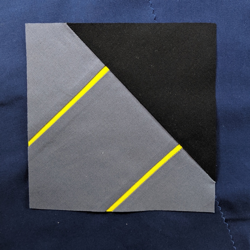
In the case this particular quilt, I started getting some ideas about colors when I was working on my prototype blocks. When I made the decision that I wanted to make the blocks more abstract, I thought using a minimal color scheme would work best. One block in particular struck my eye as far as the color palette. I really liked how the navy, black, and gray worked together.

At the same time, a fat quarter pack I had recently purchased from Gotham Quilts was sitting on my cutting table, and one of the colors in that pack kept calling out to me. It was Pear by Free Spirit. I have kind of become obsessed with this color. It’s a chartreuse with much more yellow in it than green. In certain lights it looks very yellow. But not quite. I love it. I decided I was going to use this color in my quilt no matter what. Everything else had to work with it.

During my prototyping phase, I finally decided I needed to start working with my real fabric because I was losing steam. I just wasn’t getting excited about testing out blocks in scraps anymore, and I knew if I started making the blocks for real my excitement would return. This meant it was time to make some final decisions on colors.
I chose one of my most basic blocks I had sketched out and tried it with navy, gray, and Pear. Then I tried it with black, gray, and Pear. I was also thinking about the sashing I would use around all of the blocks, so I tried several combinations. This process was a bit tedious, but it was necessary because I realized the navy wasn’t working the way I thought it would, at least not for this particular project. I also realized I wanted to frame each of the blocks in the Pear fabric. I think final color palette and the Pear frames will give the overall quilt a very graphic quality, something that will further the abstract design of the blocks.

I still haven’t figured out what color I will use for the sashing, but I can’t actually make that decision until I’ve made all of the blocks. So now it’s time to start making the blocks for real, and I’m so excited to be back on track. At the time of writing this post, I’ve made six blocks in my chosen color scheme and I’m really digging how they look.

I’d love to hear how you tackle the color selection process. Do you set parameters for yourself? Do you have a particular palette that you use for all of your projects? Do you just go with your gut and pick whatever calls to you? Tell us your process in the Comments section below, and let’s get a color conversation going! Happy crafting!

